I have a number of ‘rejects’ from previous printing sessions. I mostly hang on to them to be sure I have a similar thickness paper when using a grain focuser at the community darkroom. But reading ‘Master Photographer’s Lith Printing Course’ by Tim Rudman, I realized I could dip my toe in the Lith print water with some of these rejects. I am far from a master photographer, and even further from a master printer, but the book is the most available information on Lith Printing I could find.
So I ordered up some Moerech bleach and EasyLith from Freestyle photo and got to experimenting. The basics are fairly straight forward. Take a regular silver-gelatin print (preferable overexposed some, but I just worked with what I had), use the bleach to either bleach it all the way back, or just remove the highlights and mid-tones, then redevelop in Lith developer. Many papers that don’t print well as straight Lith prints can get some lith-like results from this technique.
Not knowing what to expect, I started with super dilute bleach (1+200) which seemed to be doing basically nothing, so I gradually increased the concentration till I could see some results. I should have been a bit more mindful of how much I added, but being a ‘tastes good’ sort of cook, I just added concentrate to the tray till I could see changes happening. I bleached back the highlights, and some of the mid-tones of my first print (original was semi-IR, shot on SFX200 with R72 filter). I then put another print in the bleach, while I prepared the EasyLith.
One really nice thing about all this process? I could do it in full daylight, and inspect the print as it redeveloped. So I agitated and then put it in the wash bath when I thought it was ready, fixed, hypo-clear, and dried. I then checked on the other print, and decided to let it bleach some more. With all these ‘rejects’ I had a number of other examples of the same image to look at and determine when to stop the bleach stage and the lith develop stage.
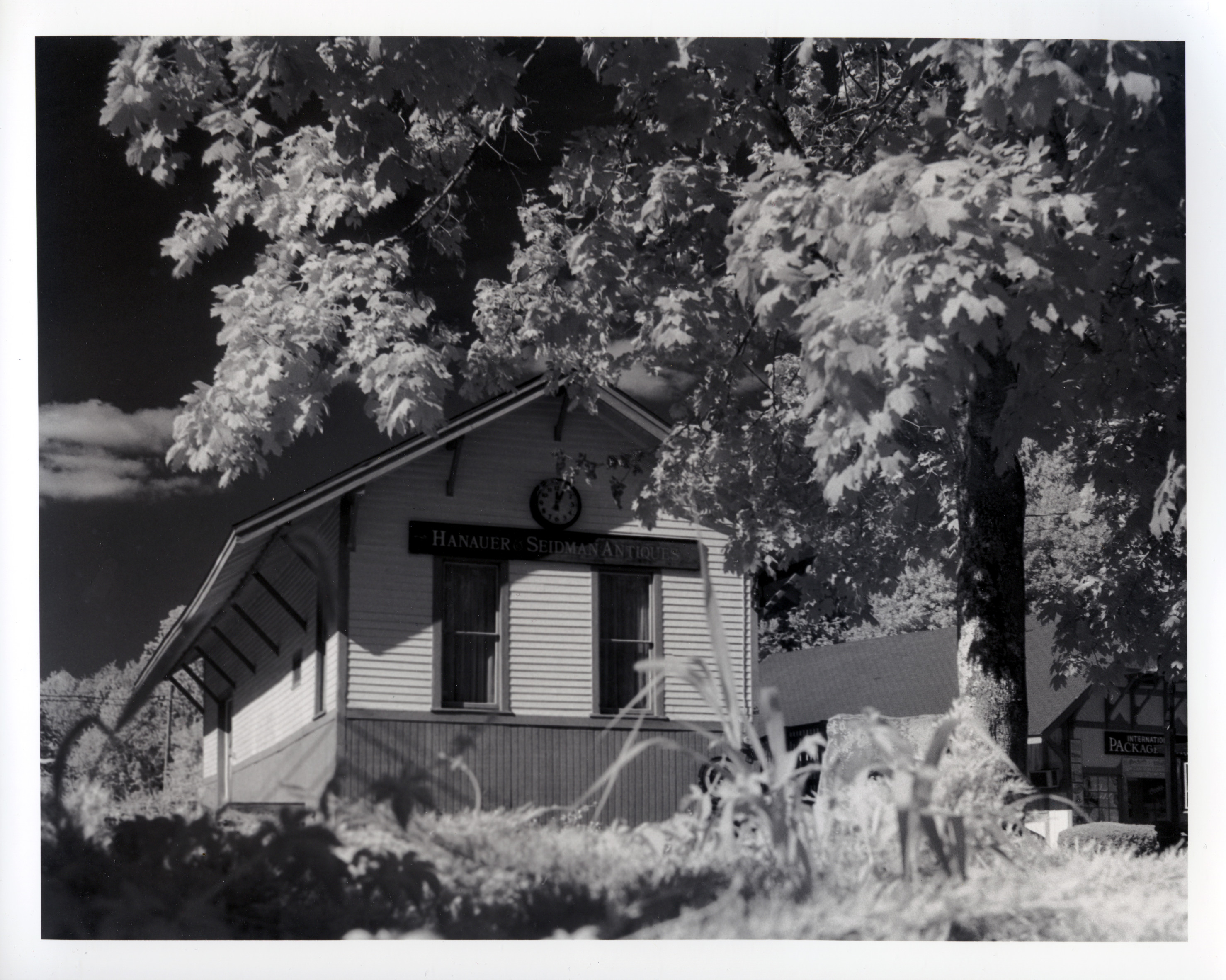

Based on Rudman’s book, this particular print probably resulted in the least amount of color difference since it was my very first print in the Lith Developer, and there tends to be a ‘sweet spot’–the Golidlock’s syndrome, first print in the developer and the colors are not very impressive, later prints after a threshold is reached, and the colors go all Frank Miller on you (dark, dark, and more dark). Despite the difference in cropping (the original print was landscape and the 2nd pass was a square print I cropped to 10×8 after scanning), I prefer the look of the lith print. It has a nice, airy look to it, while still retaining some deep shadows. I also like the gradation in the sky that is not evident in the original print.


For the Porsche shot, I really bleached it back much more than the train station shot, and it took a while in the Lith Developer to get the look I wanted. In the tray it looked a bit more coppery/orange, but during ‘dry-down’ changed to have a more subtle hue. In this case, I think the original is more bold and striking, but as I look at the two for longer, I find the 2nd pass Lith Print more interesting.
This was a fun experiment, and I think I would like to pursue more Lith Printing in the future, either direct Lith or this 2nd pass variety. Certainly with my current humble equipment (community darkroom and a kitchen), second pass is more likely.
Papers used were all Ilford MG IV RC, pearl.
